 Last week's assignment was to create a poster for a PSA (public announcement advertisement), I chose a new PSA going around called Feed the Pig. It's a campaign promoting financial literacy, specifically for adults 25-34, and reminding them to feed their piggy banks. The piece I created is a twist on some of the advertisements I came across while researching. It's pretty simple yet still effective, I think.
24 June 2009
Feed the Pig
Last week's assignment was to create a poster for a PSA (public announcement advertisement), I chose a new PSA going around called Feed the Pig. It's a campaign promoting financial literacy, specifically for adults 25-34, and reminding them to feed their piggy banks. The piece I created is a twist on some of the advertisements I came across while researching. It's pretty simple yet still effective, I think.
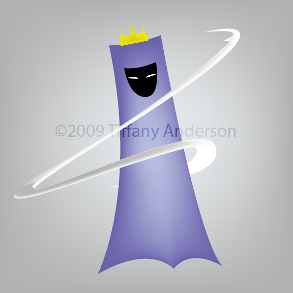
12 June 2009
Final Cover
 The task for this project was to create a magazine cover for an existing magazine using my own photography. I chose to do a cover for European magazine, Advanced Photoshop. The image used is of one took earlier during the week of the cloudy sky. See here for original image. By manipulating the image and adding some effects, I was basically showing that you can basically take a dull image and turn it into something completely different. I hope you like. It was fun making it. Comments and critics are welcome.
18 May 2009
Illustration 2, Week 2
 Creating a font isn't as easy as it seems, especially when trying to come up with something new and creative. With that being said, it's also a challenge to create a font and create a gradient mesh portrait in five days. The font I created is pretty basic and simple; it's actually my handwriting, which I personally think makes it unique in itself.
 Ah, the gradient mesh portrait. I can honestly say that I spent 80% percent of my time working on this project, and I'm quite glad I did. It was my first time working with the gradient mesh tool and I'm pretty satisfied with the results, but I'm always looking for ways to improve it.
It's ironic that I actually enjoy illustrating when I say I can't do it. Perhaps it's the perfectionist in me that pushes to the point I want to rip my hair out because I can't fix that one little flaw that no one will probably even notice.
It's now a new week with two completely new projects, and I have some brainstorming to do.
じゃね。
12 May 2009
Uncomfortable? Good.

If you think creating a font is difficult, why not take a stab at gradient mesh? I guarantee you'll go running back to creating fonts in a jiffy. There's no sugar coating it, gradient mesh is frustration, tedious, time consuming...did I mention frustrating? Is that nostalgia creeping up from 3D modeling? I think so.
Oh yeah, my three deadly sins are complete and have been presented. If you want to take a peek I'm not gonna stop you. My choices were wrath, pride, and greed. I took the more "colorful" route, so to speak. As for the simplicity, I guess it's safe to say that's my style. However, I will-- no. I AM attempting to wander off from my comfort zone for a while.
じゃね。
06 May 2009
Along for the ride
Now that spring break is over, it's now time to illustrate again. I can't say that I'm exactly enthusiastic since I've been in this creative rut for some time now, but I have to start somewhere to get it flowing again.
My first two assignments consist of four illustrations. Three of which will be a deadly sin and the last one will be a recreation of one of Saratoga Sake's art pieces. The deadline's Friday so you'll be seeing those posted by the end of the week.
My first two assignments consist of four illustrations. Three of which will be a deadly sin and the last one will be a recreation of one of Saratoga Sake's art pieces. The deadline's Friday so you'll be seeing those posted by the end of the week.
04 May 2009
On a personal note...
I was born and raised in New York city. Yes New York, New York. I moved to the central Florida area going on six years now. It did take some time to adjust to the atmosphere, yet I still prefer living in the city where driving isn't very necessary. In fact I have hopes of returning to the big city after graduating next year.
15 April 2009
Quality in Web Design
When it comes to design it seems there is always room for improvement. Whatever bit of work you create it feels there is something not quite right or just something missing. After reading an article, How to Spot Quality with Websites: Tips and Tricks, I discovered that that specific something is called quality. Amazing, isn't it?
I have gone through some of the tips listed within this article (there is quite a few to go through) and they are eye opening, especially for those looking for that extra something to make their website stand out. If you're interested, feel free to check it out. I highly recommend it. If I happen to come across anymore helpful websites, I'll be sure to bookmark them. Check out my delicious bookmarks.
I have gone through some of the tips listed within this article (there is quite a few to go through) and they are eye opening, especially for those looking for that extra something to make their website stand out. If you're interested, feel free to check it out. I highly recommend it. If I happen to come across anymore helpful websites, I'll be sure to bookmark them. Check out my delicious bookmarks.
Subscribe to:
Posts (Atom)
